Your restaurant menu isn’t just a list of dishes and prices. It’s a critical touchpoint in the customer journey, and using restaurant menu design tips can turn it into a powerful sales tool, both inside and outside your restaurant.
Your menu is often the first thing a guest interacts with, whether when dining in or browsing online. That first moment could be the turning point where a customer stays or changes destination to another restaurant.
Here comes the significance of menu design as a main part of the restaurant’s identity and experience. The layout, choice of colors and fonts, distribution of items, and even the tone of dish description.
All these directly influence the customer’s impression of your restaurant’s quality, professionalism, and brand value before their first bite.
A well-organized, attractive, easy-to-read menu reflects attention to detail and keeps the customer focused on the experience. Meanwhile, an unclear or cluttered menu diminishes the restaurant’s value and distracts guests. It could even push them to quickly leave or postpone their visit or purchase.
In this article, we’ll shed light on the importance of menu design in restaurant success. From smart menu creation to the psychology of colors to other visual elements. We’ll cover the most important restaurant menu design tips to create a catchy menu for your guests.
The Psychology of Color & Its Impact on Your Menu
Colors are a powerful visual element. Both in general and in restaurant menus in particular. Colors influence a customer’s mood and purchasing decisions. This relationship is known as color psychology, or the psychology of colors.
Warm Colors: Stimulating Appetite and Impulse
Warm colors stimulate the senses and appetite, making them ideal for menus and banners:
- Red: Grabs attention, raises the heart rate, and conveys urgency. It’s used to attract attention to special dishes or limited-time offers.
- Orange: Combines the energy of red and the cheerfulness of yellow. It’s a vital color that stimulates appetite, often associated with quality and fun.
- Yellow: Linked to happiness and optimism, yellow is used to highlight details without pressure. However, it should be used carefully since it’s also associated with caution signs.
Cool Colors: Creating Calm and a Sense of Quality
Unlike warm colors, cool shades evoke calmness and relaxation. They’re ideal for restaurants seeking to emphasize certain qualities:
- Blue: Rarely found in natural food, blue is mostly used to create a sense of tranquility, professionalism, and integrity. It doesn’t directly stimulate appetite, and that’s why it’s often used in backgrounds or in seafood restaurant menus.
- Green: It’s linked to freshness, health, and nature. Green is the perfect choice for restaurants focusing on organic, vegan, or healthy dishes.
The cultural significance of colors
When designing restaurant or coffee shop menus in the Gulf region, it’s important to take cultural connotations into consideration. Some colors go beyond their marketing function to reflect cultural values.
For example, green is associated with the Saudi flag and the kingdom’s role within the Gulf Cooperation Council (GCC).
It also symbolizes prosperity, goodness, and growth. So, using green, especially during national occasions, adds a sense of acceptance and appeal.
Read more: All You Need to Know About The Psychology of Menu Design
Restaurant Menu Design Tips: Fonts and Printing
Fonts aren’t just for aesthetics, they play an essential role in menu design and the customer experience. From impacting readability to shaping the restaurant’s brand impression and to guiding the customer’s eye while browsing.
Readability is the most important factor when choosing a font. Text, especially dish names and prices, needs to be clear and easy to read under different lighting conditions.
A menu that strains the customer’s eyes diminishes the experience and reduces the likelihood of additional orders or future visits.
There are three main font categories, each serving a purpose:
- Serif fonts convey elegance and tradition. They’re suitable for fine dining or heritage-inspired restaurants.
- Sans Serif fonts offer a modern look, which makes them ideal for fast-food and contemporary restaurants.
- Decorative fonts are limited to highlighting headlines or special sections on menus, but they should be used cautiously, not to confuse or distract readers.
Pro Tip: Avoid using too many different fonts as this creates visual clutter and weakens the restaurant’s unified identity. Your menu’s simplicity and consistency reflect professionalism and make the experience more comfortable and appealing.
Design and Visual Flow in Menus
Visual design and content layout are essential elements for the user or customer experience, both in print menus, and digital menus, whether via QR code or across your restaurant website and mobile apps.
The goal is to guide the customer’s eyes toward the most important and profitable items.
-
Position high-profit items strategically
Menu engineering aims to boost profitability by highlighting high-profit dishes in areas that grab attention. Like the top or center of a page. You can achieve this with subtle visual cues like distinct colors, frames, or symbols. For example, using a frame to draw focus to a specific dish or combo.
On the other hand, don’t highlight less profitable dishes, but present them without distracting attention to maintain menu balance. This turns the menu into a smart marketing tool that directs customer choices and supports profits.
-
Create visual balance with white spaces
White spaces aren’t emptiness, they’re a design element that enhances clarity and simplicity.
They make menus look organized, professional, and easy to read. They ensure sections are clearly defined and key items are highlighted without visual clutter.
-
Enhance navigation by grouping categories
Organizing content into clear, logical categories, such as appetizers, main courses, and desserts, helps simplify design and the customer experience.
It helps guests quickly find what they’re looking for and understand the menu’s layout, leading to faster decision-making.
Restaurant Menu Design Tips: Images and Other Visual Elements
Images and visual elements stimulate the appetite and influence purchasing decisions. They’re effective marketing tools that enhance the appeal of your dishes and beverages, while supporting brand identity.
Focus on professional images of profitable or special dishes, as quality images increase the likelihood of an order. You can also generate some pictures and descriptions using ChatGPT.
To avoid visual crowding and maintain an organized and elegant look, use one image per page.
Make sure all pictures are of high resolution and accurately represent the actual dishes. You should also avoid stock photos. Instead, invest in photographing your restaurant’s dishes to give your menu originality and reinforce credibility and trust.
Use other visual elements, such as icons and illustrations, to guide customers. For example, you can use them to highlight special dishes or clarify preferences (vegan, spicy, gluten-free).
By combining visual appeal with functional clarity, your menu will encourage customers to make purchasing decisions confidently.
Visual Identity in Menu Design
Building a strong restaurant identity requires consistency in design. Your menu should reflect the same visual style of your brand, including logo colors, fonts, and even images.
This starts with unifying colors, fonts, and taglines used in the menu with those found on the brand’s website and other marketing materials. This visual consistency reinforces brand identity and makes customers’ experiences harmonious and seamless.
Visual identity also extends to the entire dining experience. The menu doesn’t operate alone. It should be in harmony with the decor, lighting, and even service style.
This ensures each customer touchpoint becomes part of the brand story, building loyalty and leaving a lasting impression of distinction and quality.
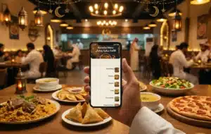
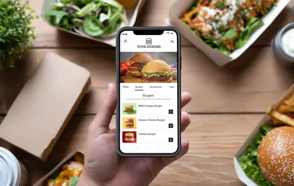
Menus: Digital vs. Printed
There are many ways to present menus. But the goal remains the same: offering a seamless experience that helps guests make decisions comfortably and confidently.
While digital menus are widespread, print menus still hold a special place in the world of hospitality.
Print menus convey a sense of class and attention to detail. Premium paper, soft colors, and elegant design enhance the restaurant’s image and enrich the guest’s experience. This is especially so in fine dining restaurants that build their identity around tactile touches and physical appearance. This type of menu also helps guests focus away from distraction, creating a calm and fun moment of choice.
On the other hand, digital menus represent speed and flexibility. They’re easy to update and can show pictures and interactive details that raise the customer’s interest while ordering.
Moreover, they adapt to various devices, from smartphones to self-ordering screens.
Digital menus also allow for smarter suggestions like adding a side dish or upgrading a meal size. This helps increase the average order value and boost sales.
Ultimately, the success of the dining experience isn’t about choosing one format over the other, but about understanding the nature of your restaurant and guests. Some brands prefer the elegant touch of printed menus, while others rely on the interaction and flexibility that digital menus offer. Between the two types of menus lies a wide space to mix both smartly to create a balanced and modern hospitality experience.
Foodics QR menu system
Foodics offers an integrated QR menu system that enables restaurants to transform their menus into a seamless digital experience. It enables easier browsing for guests, so they can place their orders directly using their phones, and even pay electronically at the table.
This achieves higher operational efficiency and reduces crowding inside the restaurant.
Wrapping It Up
A menu should never be viewed as an ordinary paper, but as your most powerful silent salesperson. It’s the only tool capable of speaking on behalf of your brand, tempting guests with your restaurant’s dishes and guiding them towards the most profitable options, all without direct human interference.
A well-designed menu combines color psychology, font coordination, and strategic planning to achieve one goal: Raising your revenues and sales and improving the customer experience.
That’s why we encourage restaurants to invest in menu design. This investment should be focused on data, analyses, and reports provided by Foodics POS system to understand customer behavior and continuously upgrade the menu.
Follow the abovementioned restaurant menu design tips to achieve this equation of beauty, efficiency, and sales.